Wednesday, June 10, 2015

Final Exam

This year, I took a photo of Valerie Choung in an arabesque.
Valerie Arabesque
This photo changed my perspective of not only photography, but also editing. I learned a lot with this single shot. It took me many tries to get her in the position I needed and a lot of detailed editing to get a clean, white background. After this assignment, I gave a lot more of my attention to detail and took some of my best and favorite photos.

~~~
Shape and form may be noted in a single photo, but they are both very different elements. Shape is two-dimensional, and form is three-dimensional. In my "Element of Shape" photo, you can see the shape of the leaf in 2-D. In my "Element of Form" photo, you can see the many shapes that make up the blooming, 3-D flower. Since all photos are 2-D, it is the light and shadows that make form prominent in a photo.

~~~
Repetition is the repeating of something once or twice; any more than that makes a pattern. Wherever there is a pattern, there is repetition. In my "Principles of Design: Repetition" photo, there is a visible pattern, but as a photographer, for this particular assignment, I was focusing on the two lights on either side, the yellow lines of the stairs, and the two columns/poled on either side of the door. In my "Principles of Design: Pattern" photo, there are many patterns. The most eye-catching for me is the blue, red, and white pattern created by the flags. There is also the green and white pattern on the lane dividers, the border of the pool, and the texture of the wood.

~~~
This is my Weebly About page: http://nehasaxena-dp.weebly.com/about.html.
I was inspired by Nick Onken's About page.

~~~
My last three projects were:
First Commercial Shoot
Spring Expo
Last Project
My best was the Spring Expo, because, for one, it was the least rushed from the three for me. I also kept the rules of composition in mind with my photos. I included the use of shadows, by experimenting with the lighting, and I got close. I captured form really well in four of the photos, and in one (the silhouette), I incorporated the element of shape. After this project, I paid more attention to shadows and the element of form. This changed me, because before, I didn't realize the difference a shadow or different placement of light would make on the same photo. I learned to look at light very differently.

Friday, May 29, 2015

Student Website Reviews

First Period: Aileen Hsu
I thought her best photo was from her Spring Expo. A girl was blowing "bubbles," drawn from chalk. The photo shows good use of movement, from her arm to the bubbles and back.

I though her best photo was of the yellow flower, because it showed the composition of getting close. 

Third Period: Aarti Panda
Her best photo was of the ocean and the pier. It exhibits the rule of thirds. One third was the sand, one the ocean, and one the sky.

Wednesday, April 29, 2015

Triptych

Original Photo
Edited in Camera Raw
Final: Don't Turn Around

Tuesday, April 21, 2015

Photo Story MCW

A Day In the Life of a Student During MC Week
Everybody Rushing to the Horseshoe Where the Food is Being Sold
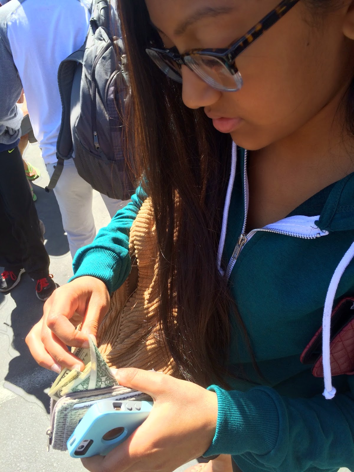
The Students Use Their Money to Buy Tickets
Buying Tickets to Trade them for Food
Buying Food With the Tickets
Enjoying the Food


Thursday, April 16, 2015

Story With a Photo - Cloudy with a Chance of Culture

I took this photo of the sky today, Thursday, April 16th. Today is Europe day, and everybody is supposed to wear blue. The sky is blue, and the clouds show commotion and freedom which is what the students experience this week. Lunch lasts for more than one hour, and the horseshoe at the front of the school is packed with students. Multicultural Week is so fun, but it is coming to an end.

Wednesday, April 15, 2015

MSJMCW Story

  At Mission San Jose High, we devote a week to celebrating the cultures of the world. For the first four days of Multicultural Week, different foods are available at stands in the horseshoe. Students can buy chow mein, samosas, popcorn chicken, burgers, burritos, tea, and so much more.
  Besides the food, many students also get excited about the school assembly on Fridays. Students themselves perform for their peers, whether it's Bollywood dancing, taekwondo, ballet, tinikling, or something else. On Thursday night, all of the groups meet at the gym for one last run-through before the big day. Nobody is seated in the audience, but the vibe created by the students and leadership crew feels so real.
  Friday has come, and all the performers are anxious to begin. They wait in the gym quad and sneak peeks at the performances prior to their own. They are full in our costume and makeup and are ready to run onto the dance floor. They all spent countless hours preparing for the next five minutes of their lives.

Thursday, April 2, 2015

Shutter Speed and Everything After

My partner is Khushbu Patel.
Lens Blog Photo
1. The shutter speed of the photo is fast, because the trucks on the freeway are in focus, and vehicles on the freeway are always moving pretty fast.
2. One rule of composition you can see in this photo is the Rule of Depth. The viewer can see all the way down the guardrail. Khushbu noticed the rule of leading lines, because of the lines drawn on the freeway and of the guardrail leading the viewer's eyes down the road.
3. You can see the element of color in this photo. There are the colors blue, green, white, and red on the three trucks, and there is green on either side of the road in the grass.
4. This photo accurately captures the principle of repetition. The structures of the guardrail repeat in an orderly pattern, and the lines on the truck on the left create a pattern of blue and white. The is also repetition in the wheels of the truck on the right and the lines of the freeway.


Tuesday With Farley's Kids
On Camera Raw, I decreased the contrast by 60, shadows by 100, and the saturation of yellow, green, and orange by 75 each.
The shutter speed was 1/1200s.

Friday, March 27, 2015

Principles of Design: Unity


This photo shows the harmony between all of the lines and bolts on the car wheel. The spokes all join in the center of the wheel, where the bolts are all placed.
On Camera Raw, I converted the photo to grayscale. 

Principles of Design: Variety


For this photo, I used several principles of design to show variety.There is balance between the two sides of the photo, there is pattern and repetition on the roof, and emphasis created by the bird structure on the roof.
In Camera Raw, I increased the contrast by 30 and decreased the shadows by 100. I also decreased the saturation of green and aqua by 60 each.

Principles of Design: Rhythm


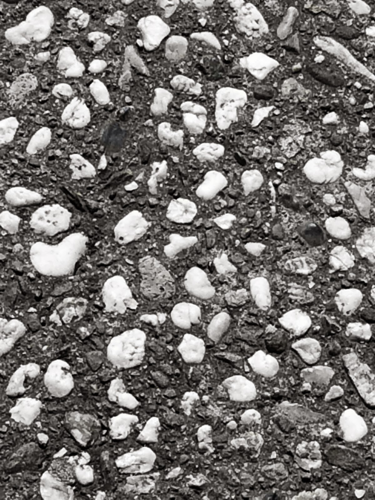
I took this photo to show the principle of rhythm. This photo gives off a feel of organized movement and consists of a variety of stones embedded in the ground. A variety of principles of design can be noted, as the texture of the rocks repeats itself in an organized cluster and pattern.
In Camera Raw, I increased the contrast by 75 and completely decreased the saturation of yellow and orange. 

Best Use of Variety

In NYT's album, Documenting the Blues in the Mississippi Delta, my group and I found Photo #7 to show the most variety. The babies in the photo show the principles of balance and repetition, since one child is in either arm of the mother. When you look at the mother, you can also see the principle of pattern on her dress and the principle of proportion (the babies' size in comparison to their mother). 

Wednesday, March 25, 2015

Principles of Design: Proportion


I took this photo to execute the principle of proportion. In this, the girl's size is being compared the that of the car wheels. The viewer can also compare the size of the wheel with the car.
In Camera Raw, I cropped the photo and decreased the saturation of blue by 50.

Monday, March 23, 2015

Half Past Autumn - Gordon Parks Parts 3 and 4

1. My definition of successful is having achieved all your goals in life and being able to support yourself at the same time.
2. In order to be successful, I have given up my free time.
3. Parks gave up his hometown to be successful. He left his home when he was just fifteen years old and ever since worked to become a photographer in order to provide for himself.
4. Genevieve Young's father was Ambassador V.K. Wellington Koo.
5. When Gordon parks wrote Choice of Weapons, he received $10,000 for the first seven pages.
6. Elijah Muhammad offered Gordon Parks $50,000 to do the story.
7. Parks refused the money because he wanted his film to say something and leave an impression on the viewers. He didn't care about the money.
8. Gordon Parks's movie, The Learning Tree, was important to the Hollywood film industry because it was the first movie written and directed by a black man.
9. Shaft was a young black superhero, and one of the first.
10. Gordon Parks's Choice of Weapons was an autobiography published in 1966. It was about how he resisted the use of weapons like guns and knives. Instead he used his pens, cameras, and paint brushes.
11. The couple divorced because the slightest thing would become a problem. Genevieve couldn't live in the spontaneous world that Gordon was a part of. The turmoil in his life and her trying to keep it controlled wore her out.
12. 12 Years by Steve McQueen and released in 2013 told the same story.
13. Gordon Jr. was Parks's first son, who ran out of money in attempt to make his film. He was the director of the movie. He was very much like Gordon Parks, always out. He died in a plane crash.
14. My favorite Gordon Parks photo is from his Segregation Story of a white woman and her black maid holding a white baby on a train.
15. In ten years, I will remember Gordon Parks' success, his movies in specific. 

Thursday, March 19, 2015

Principles of Design: Repetition


I felt like my photo properly executed the principle of repetition because of the fourteen windows on the building. Within each window, there is a pattern that is repeated in the rest. Also, on either side of the staircase, there are two large poles. There are also two lights, one on the left and one on the right. In addition, there is the repeating yellow line on each of the three stairs.
In Camera Raw, I increased the contrast and highlights by 100, and I decreased the shadows and blacks by 100. 

Wednesday, March 18, 2015

Principles of Design: Pattern

Several patterns are visible in this photo. An obvious one would be the red, white, and blue flags hanging above the pool. There are also the lane separators, which have alternating colors (green and white) running down the lines. The border around the pool show a different pattern: squares side by side. There are also less obvious patterns that may be noted by my viewers, like the texture of the wood and the lines of the drain running down the side of the pool.
Using Camera Raw, I increased the contrast of colors by 25, highlights by 45, vibrance by 25, and luminance of red and green by 100. I decreased the saturation of orange, yellow, and green by 100 and the clarity by 50. 

Tuesday, March 17, 2015

Principles of Design: Movement

I took this photo in hope of creating a path for the viewers' eyes. I tried to start the path at either one of the wheels. My eyes tend to start at the wheel on the right, but members from my group have informed me that their paths begin at the left wheel. The path created in the photo should then take one's eyes to the blue parts of the structure and then around the whole photo.
Using Camera Raw, I increased the saturation of blue and clarity by 30 and decreased the saturation of red by 15.

Wednesday, March 11, 2015

Principles of Design: Emphasis

I took this photo to emphasize the the light bulb. It is the brightest part in the frame of my photo, so the viewers' eyes will automatically go there first.
I took this photo to Camera Raw and decreased the exposure by 1.25, shadows by 100, blacks by 50, and vibrance by 100. I also increased the contrast of the colors by 80 and highlights by 100. 

Tuesday, March 10, 2015

Principles of Design: Balance

I used Camera Raw to decrease the saturation of red, orange, and yellow by 100. 

Friday, March 6, 2015

Elements of Art: Texture

Using Camera Raw, I increased the saturation of green by 20 and blue by 20. I also increased the clarity by 10. 

Thursday, March 5, 2015

Elements of Art: Color

I used Camera Raw to increase the contrast by 50. I also increased the luminance of yellow by 100 and decreased its saturation by 100. 

Wednesday, March 4, 2015

Elements of Art: Space

I took this photo to Camera Raw and decrease the saturation of yellow and orange. I also decreased the luminance of green by 50 and added clarity by 10.

Tuesday, March 3, 2015

Elements of Art: Forms

For this photo, I reduced the green saturation by 100 and cropped the photo to pull more focus to the form of the flower and leaves. 

Elements of Art: Shapes

For this photo, I used Camera Raw to decrease the saturation of the red, orange, and yellow. I also increased the clarity of the photo by 20. 

Monday, March 2, 2015

Half Past Autumn - Gordon Parks Parts 1 and 2

1. The doctor saved his life by dunking him into a tub of water and rubbing him against ice.
2. He was born in Ft. Scott, Kansas.
3. His class adviser told him that few negro students attended a college because they were not college material. She also told him not to waste his parents' money going to college and would probably just end up as porters or maids.
4. Gordon was 15 years old when his mother died.
5. Gordon moved to Minnesota, where his sister and brother-in-law lived.
6. Yes, he did graduate college.
7. He began his fashion career, when he offered to photograph three women for a clothing store. He accidentally double exposed his photos, but he was able to fix one. It was so impressive that Gordon was asked to provide the other prints, and when he explained his accident, Gordon was given another chance to take the photos. That was how Gordon began his fashion career.
8. It is the repeated exposure of a photographic plate or film to light, often producing ghost images.
9. Joe Louis was the husband of the woman who invited Gordon to Chicago for a photo shoot after seeing his photos.
10. Gordon played the piano.
11. The purpose of the Farm Security Administration was to combat American rural poverty during the Great Depression.
12. Stryker's first assignment for Gordon was to leave his camera behind and walk through Washington D.C.
13. Ella Watson was the woman who Gordon saw mopping the floor. He asked to take a photo of her in front of the American flag.
14. Gordon was inspired to take the photo after visiting Eldon, Iowa. He noticed a little wood farmhouse, where he imagined American Gothic people with long, stretched faces.
15. Gordon learned about how the people (models) in front of the camera were more important than the one behind it. He also learned about humanity.
16. The FSA was shut down in 1943.
17. After Gordon moved to New York, he shot for Vogue.
18. The picture editor of Life Magazine was Wilson Hicks.
19. Parks's first major story for Life Magazine covered the Harlem gang story crime across America.
20. One of the artists that Gordon Parks mentioned influenced his work was Van Gogh.
21. Parks shot fashion at a slow speed and by moving with the model to keep his subject in focus.
22. Parks' concerto was performed in Venice, Italy.
23. Parks' second wife was Elizabeth Campbell. She was the founder of  WETA tv, a teacher, a college administrator, and an Arlington Public Schools board member. Elizabeth's father was a Moravian minister.
24. Flavio de Silva was 12 years old when Parks first met him.
25. Parks met Flavio in 1961.
26. Flavio de Silva lived in a shack in Rio de Janeiro with his family. 

Thursday, February 26, 2015

Elements of Art: Lines


For this photo, I used Camera Raw to decrease the saturation of the blue and purple. I also increased the clarity of the photo by 10.


Tuesday, February 24, 2015

Top 5 Photos Ranking By Group

My group and I picked the 5 photos we thought were the best from the album.
1. Photo 5 - Two Hands with Wheat
2. Photo 9 - Boats and Sunset
3. Photo 12 - Chained to a Wall
4. Photo 22 - Girl Studying
5. Photo 3 - Water

Friday, February 20, 2015

Multimedia Festival Poster Take 2


Why is this poster good or great? This poster is really good because it is well composed and has a professional vibe to it. It is also more eye-pleasing and user-friendly, because the only photo on the poster is utilized as the background and the colors are more neutral. The neutral colors of this poster keep it from looking too cluttered. If she were wearing brighter colors, then it may have drawn too much attention away from the information.
Why is this poster better than the original? The two posters we created for the multimedia festival are incomparable, and I am proud of both. However, this poster has a more professional and clean look, which is advantageous to our goal of trying to spread the word. Also, our second poster is more artistically pleasing, because we were introduced to different features on Photoshop that we hadn't known about the first time around. Also, there was only one large, eye-catching photo on this poster, which draws your attention to it. It is a much better way to convey our message. Also, the address used in this poster is updated, as the address on our original poster wasn't as accurate.
What did you do to create this poster? We started with a white background, sized at 11 by 17 inches. Then I used my iPhone 5s to take a photo of Tulika Mohanti and her camera to emphasize the photography category of the festival. We made that the background, decreasing its opacity to 50%. After that, we added in all the text and information and placed them accordingly. After some tweaking here and there, we were able to come up with this.

Friday, February 13, 2015

Movie Monday - The Photo League

The Photo League Assignment

1. What was the Photo League's credo? The Photo League's credo was based on documentary photography, paying respect for the efforts of human workers. The camera was meant to capture reality, and it had the potential to change our world. 
2. What organization did the Photo League separate from? They separated from the Film and Photo League. 
3. What was the workshop? The workshop was basically a set of classes or a course, where the teachers worked to teach and inspire their students about documentary photography. Anyone with a functional camera was welcome to come learn for a fee of five dollars. 
4. Who taught the workshop? Sid Grossman taught the workshop. 
5. If you were to devote one year of your life to one project, what project is worth your time and energy? I would hope to devote a year of my life to photographing the lifestyle of a professional dancer, because I love to dance. I only dance about five hours a week, but professional dancers spend night and day at the studio. It would be an amazing opportunity to attempt to explain an entire lifestyle in one year.  
6. What was the Harlem Document? It was a multi-year collaboration between five photographers, portraying Black urban America. The Harlem Document showed the people, culture, and lifestyles of the Harlem in the 1930s.
7. Who started the Harlem Document? Aaron Siskind started the Harlem Document.
8. A photographer discusses a photograph where "the children looked like they came out of a Caravaggio painting. 
9. Why did the photograph mentioned in #8 look like it was by the painter? Caravaggio is known for his use of realism and chiaroscuro, which was clearly noticed in the photograph of the children.
10. Who was Lewis Hine (name two significant contributions)? He influenced a change in child labor laws in the United States and led to the development of documentary photography.
11. Who was Weegee? Weegee, or Arthur Fellick, was a member of the Photo League. His photographs were based on the hardships of people's lives, like of those who were drunk or lived in tenements. Weegee was very unhygienic, and he smoked a lot. He taught classes on freelance photojournalism and flash photography.
12. How did the League change when the Nazis took power? A majority of the talented and skilled European photographers fled to the United States and joined the Photo League. However, finding jobs was a major difficulty because of their country of origin.
13. How did the League change during WWI? The League captured Patriotism and provided support. The female members kept the League running, while the males left to participate in the war or photograph it. After WWI, the Photo League became very popular.
14. How did Didkind change after WWII? Aaron Siskind brought concepts of abstract expressionism to photography. Before WWII, Siskind had taken photos that reflected sociological realism.
15. What was the Saturday Evening post? The Saturday Evening post was a part of the photojournalism field that featured the Photo League's work. It was a post from 1947.
16. Who was Barbara Morgan? What did she photograph? Barbara Morgan was a photographer, best known for her photography of modern dancers.
17. What eventually undermined the Photo League? The League was under a government list of allegedly totalitarian, fascist, communist, and subversive groups. The members were blacklisted and engaged in a fight for survival.
18. What was the "Growing Menace" mentioned in the film? It was the totalitarian, fascist, communist, and subversive groups that the government was trying to eliminate.
19. Who agreed to serve as President when the League was under investigation? When the League was taken under investigation, Life Magazine journalist W. Eugene Smith agreed to serve as president of the Photo League.
20. What happened to the Leage? It ended up falling apart and was officially shut down in the summer of 1951, due to a label it received, claiming it was radical and a communist organization. People stopped showing up to work, and the public became confused because the League had always showed that photography was an art and never mentioned politics. 

Tuesday, February 3, 2015

Poster Assignment

My group and I attempted to recreate the Bob Dylan at the Q.E. Theater, Vancouver, 1965 concert poster. My model was Khushbu Patel, and I used Photoshop CS6 to edit the photos and create my poster.
Khushbu Patel at the MSJ Amphitheater, Fremont, 2015 

Thursday, January 22, 2015

Period 4 - Semester Final

  1. What is your favorite photo from this Lens slideshow? Provide three reasons that it is your favorite. My favorite photo is Photo #9 of the red deer. I really like this photo because it's mysterious, and it draws my attention. I also love animals, the deer being one of my favorites. I like how one cannot tell the distinct features of the animals, but he or she could still be able to tell that it is a deer. Also, I think silhouettes are the most eye-pleasing photos. 
  2. Which photo is the best from the slideshow? Provide three reasons. I think that Photo #6 is the best photo. Not only does it capture simplicity, it also follows the "Rule of Thirds." The photo also caught the car in motion which adds to the quality of the photo composition wise. 
  3. What is your best work this semester? Include the blog link. Give three reasons why this is your best work. If you had more time, how would you do to improve the project. My best work was a photo from my "Masters of Photography" Project on Imogen Cunningham. I took a photo of a tea kettle , and I feel it was my best, because it shows a lot of texture. Through the clarity of the photo, one can notice the rough texture of the bench in the background (which the tea kettle is set on) and the shine and smoothness of the kettle itself. Also, the photo fills up the frame (which is a rule of composition), and is therefore very simple, too. The simplicity, texture, and composition of this photo are what makes me feel like it is my best piece of work. If I had more time, though, I would have left the photo in color, because the brown shade of the bench would have made it look nicer, in my opinion.
  4. You chose three rules of composition. What are your three rules? The three rules of composition I chose at the beginning of the semester are the rules of leaning into the frame, avoiding the middle, and providing texture
  5. Select one of your own photos that illustrates your ability to apply at least two of the three rules. Insert the photo into the post and label the picture. Clearly include the two rules of composition that you are using. I have selected the photo I took for our 6th photo assignment. The photo clearly portrays my two rules of avoiding the middle and providing texture. My model is not centered, but instead slightly to the right. Also, her knitted sweater provides texture to my photo, as one can see every individual hole between each stitch. 
    Conversations with Tulika
  6. I have three rules of composition. I have explained one already. What is my first rule? Mr. Farley,you have already explained your rule of "getting closer." This means to get close to the subject or object when you are taking a photo. 
  7. What are the benefits of working in groups? Provide a list with five benefits.There are many benefits to working in a group. Some include being able to ask your fellow members any questions, being able to share advice and thoughts to create better works, and anytime I need a model, I have three people waiting right there, usually willing to be one. Also, one can use their group members for inspiration or motivation, and it is always more entertaining to work with your peers, rather than alone.
  8. What are the difficulties of working in groups? List five difficulties. There are not too many difficulties of working in a group, but one would be the length of the process. When in a group, nobody can be left behind, even if that means waiting for a member to finish taking his or her photos.So ultimately, it takes longer to do some things than it would have solo. Also, when you're working in a group, you may be wasting more time when you get off task, which is quite easy to do. A third difficulty would be agreeing on different matters. We are all different people, and have our different opinions, so sometimes it can be hard to collaborate and form one idea that we all agree on or believe. Also, sometimes there is unequal participation. One group member could be doing all the work, while another is doing nothing. Lastly, different viewpoints can limit one's creativity in their work and prevent them from working to the best of their abilities. 
  9. What is your favorite work product produced by another person in this class? Provide the link to their work. I really like Tulika Mohanti's 3rd photo for the "Masters of Photography" Project, Ashlesha Sathe, Singer, 2014. I like the simplicity of the photo and the black and white effect makes it look really nice. Also, the photo is of one of my best friends. 
  10. For the "Masters of Photography" Project, my group and I chose to recreate the photos of Imogen Cunningham. She is a great photographer and contributed her style of simplicity with great detail and clarity to the field of photography. Her techniques are still used today, and she influenced many photographers of her own time. 
  11. Dorothea Lange's most popular photo was Migrant Mother, and it was taken in 1936 in a camp for agricultural workers in California. 
  12. Henry Robinson Luce was the founder of Life magazine, which began publishing on March 3rd of 1923. Luce was referred to as "the most influential private citizen in the America of his day."
  13. Robert Capa was a founding member of Magnum Photos, which started in 1947.
  14. The photo, "Falling Soldier" was taken on September 5th of 1936 in Cerro Muriano on the Cordoba Front in Spain.

Thursday, January 15, 2015

Album Cover Recreation

This is my recreation of John Lennon's Plastic Ono Band Album Cover.
See the original photo here.

I took my photo to Camera Raw, where I decreased the clarity by 100 and exposure by 0.45. 

Plastic Ono Band Recreation


Monday, January 12, 2015

Masters of Photography Project Reflection

Imogen Cunningham Project Reflection


  1. How do you think your project has represented you as a person? For this project, I attempted to recreate the photos Imogen Cunningham took. She took many botanical pictures, so I used that as inspiration to photograph the pretty flowers around school. She also took several portraits, so I took photos of one of my best friends.
  2. How has your understanding of photography changed during this school year? Whenever I heard the word photography, I though more about professional photos and photoshop. But the type of photography I've done so far this year was more freestyle and random. It's not as strict with rules as I had imagined. 
  3. What are some benefits of working in a group? Working in a group is really convenient, because you have your peers who can help you when you have a question or give you advice on how to take a photo. Also, anytime you need a model, you have three waiting right there, usually willing to be one.
  4. What are some disadvantages? The only disadvantage I could think of for working in a group is working at a pace that everybody can keep up with. Sometimes in our group, half of us would have our work done, but half of us wouldn't, so we were going outside more than we needed or we weren't going out enough.
  5. Now that you have had time to reflect, is there anything that you would've done differently with the recent project? I would definitely change some things from the Masters of Photography project. I wish I had used a camera with better quality to capture the same detail that I noticed in Imogen's photos. Also, I wish I had used a simpler background for some of the photos I took. That way there could have been more focus on the subjects of my photos. 
  6. Is there anything else you would like to include? I really enjoyed this project and hope to do more like it this year.